
Generating analytical PDF reports from free text survey responses

Image Source: Image by Glenn Carstens-Peters on Unsplash
A practical guide to extracting and presenting key insights from unstructured text using topic modelling
Free text response boxes are commonly used in surveys and questionnaires to collect detailed feedback from respondents in an unstructured format. The answers respondents provide can offer valuable insights that are not always captured in structured questions or multiple-choice options. However, analysing these unstructured responses, and communicating the findings to a non-technical audience, can be difficult.
In this blog, we provide an overview of an automated pipeline we have developed to extract themes from survey text responses using topic modelling. Upon completion, the pipeline saves the analysis in a report-style format to a PDF document, which can be reviewed by relevant stakeholders.
Please refer to the Practical Example section at the end of this blog post for instructions on how to use this code, to generate similar reports on other data sources.
Background
The Data Science Unit developed this project with colleagues from Knowledge and Analytical Services in Welsh Government to extract insights on free text responses from an internal staff survey. The requirements of this work were:
- To generate clear and accessible outputs which could be shared with non-technical stakeholders.
- To be able to generate custom reports at a (sub)department level.
- To develop code that could easily be re-used for future years of the survey.
Following the project, we generalised the code to make it open source and share on GitHub for others to use on their free text survey responses. This blog walks through an example of applying the code to publicly available Vision Zero Safety data, which can be used under the CC BY 4.0 licence. This is an open dataset published by City of Washington that contains over 5,000 responses from different road users describing their experiences of travelling in Washington DC in 2015.
Data Preparation
Cleaning
First, the pipeline reads data from a csv file and applies the following basic processing steps:
- Removing excess whitespace, punctuation and stop words (e.g. “an”, “the”, “of”, “in”)
- Lowercase all text
- Lemmatising words (convert to root form e.g. “buses” -> “bus”)
The pipeline then applies a spaCy Named Entity Recognition model to flag and remove individuals’ names as part of the preprocessing steps. To further protect anonymity, words that are mentioned 3 times or less are excluded from visualisations, to prevent rare, potentially disclosive or sensitive words from appearing in reports.
The pipeline can optionally extend acronyms in the text, by using a manual lookup file. Analysing responses with acronyms, which could represent organisation or location names for example, can be difficult if you are unfamiliar with the domain. Therefore, updating them with the actual full text equivalent can make it easier to understand the wider context. The table below shows an example of some acronyms being converted and added back into the text using a lookup file.
Table 1: Examples of acronyms in the Washington Vision Zero Safety data, with the updated text containing the full name equivalent
| Acronym | Full Name | Updated text |
|---|---|---|
| USPS | United States Postal Service | …delivery driver (FedEx, united states postal service) block bike lane here time… |
| WMATA | Washington Metropolitan Area Transit Authority | …vehicle washington metropolitan area transit authority buses particular speed… |
A histogram is plotted showing the distribution of response length in the survey before and after cleaning, an example of this is shown in Image 1. This graph can be used to understand if there are enough comments, of sufficient length, to perform text analysis on. Excessive cleaning may shorten responses and remove important words. Topic modelling, a type of text analysis that identifies collections of words that are frequently used together, generally performs better on a large number of survey comments (documents) and also when those documents are longer. Therefore, removing too many words may make it harder to detect word patterns and understand the context of each response.
Figure 1: Distribution of word count for raw and cleaned responses
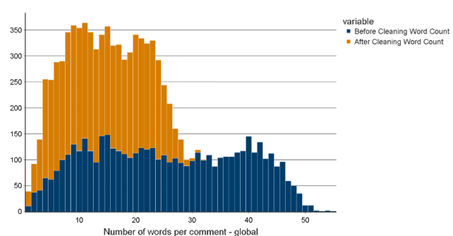
Figure 2 shows the type of vocabulary in used in responses to determine the quality of the data, by assessing the amount of “noise” compared to useful, informative language. For example, prepositions or interjections might not contribute much to the comment’s meaning or underlying themes, compared to adjectives or nouns. A Part of Speech tagger tags each word in each comment, to generate the following graphs:
- The frequency of each word type across individual comments
-
The top 10 most frequent words by word type Focusing on the most frequent adjective and nouns, in the Vision Zero Safety data:
- modes of transport,
- users of the road
- street infrastructure
are referenced most often in the text.
Figure 2: Graphs showing most frequent adjectives and nouns in the text data as labelled by a part-of-speech tagger
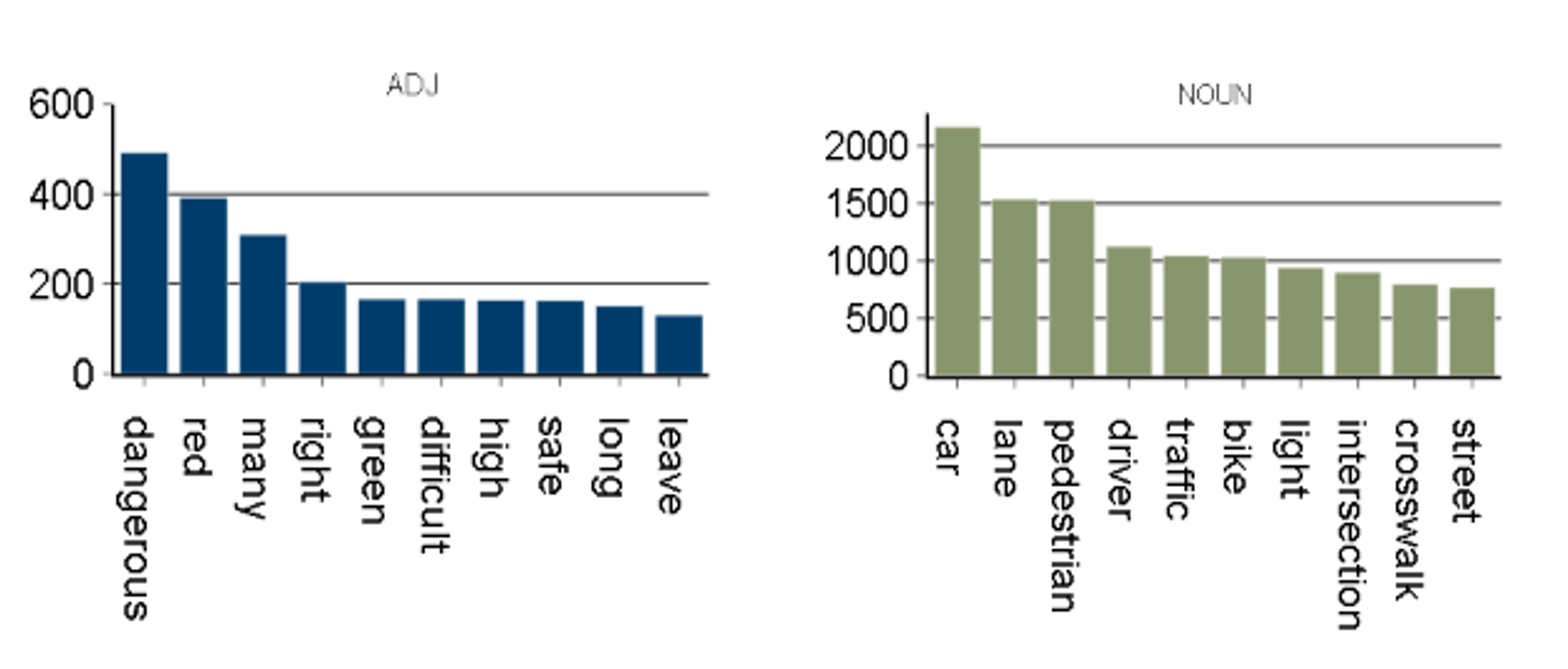
Although these charts give a good idea of the most common, generic vocabulary being used, it doesn’t highlight the distinctive words in the responses that might indicate what specific topics are being discussed. A weighting approach is implemented to try and reduce the influence of common, generally less meaningful words in the text.
Vectorisation
Term Frequency-Inverse Document Frequency (TF-IDF) vectorisation is applied to the text data. This technique weights words depending on how frequently they are used in the survey; words that are either very common or very rare throughout all survey response are given a low weight. Conversely, words that are used very commonly in a distinct subset of responses are given a high weight. These words usually help distinguish between topics, so they are weighted more heavily in the analysis. Pairs of words used commonly together that mean something specific (as identified using the TF-IDF weights) are replaced with a single token, as shown in Table 2.
This helps preserve meaningful phrases (words that appear next to each other) that might be split apart later in the analysis. For example, in the table below, the pairs of words ‘bus stop’ and ‘bike lane’ (consisting of two tokens) are replaced with a single token (separated by an underscore) in the final cleaned text response. In this case, the new token will always be associated with street-level infrastructure, rather than with the individual modes of transport.
Table 2: The final cleaned text response after important bigrams have been replaced with a single token
| Original Text | Important bigram | New joined token | Cleaned text |
|---|---|---|---|
| …makes no sense, makes it hard to avoid the bus stop and bike lane… | ‘bus stop’, ‘bike lane’ | ‘bus_stop’, ‘bike_lane’ | … hard avoid bus_stop bike_lane… |
Analysis
The first part of the analysis expands on the part-of-speech tagging visualisations to return the top 10 weighted and unweighted unigrams (single tokens) and bigrams (two tokens) in the text data. This highlights the most meaningful words in the text and helps confirm that the cleaning steps, such as removing stop words, were successful.
Figure 3 is an extract from the final report showing the top 10 most important bigrams, ranked by TF-IDF weighting, from the Vision Zero Safety data. The graph shows a clear theme; words associated with traffic lights and pedestrian crossings are most significant in the responses. This wasn’t apparent looking at the individual counts of specific words in Figure 1, demonstrating the benefit of using a weighting technique to highlight key words and phrases in the responses.
Figure 3: Count of top 10 most important weighted bigrams
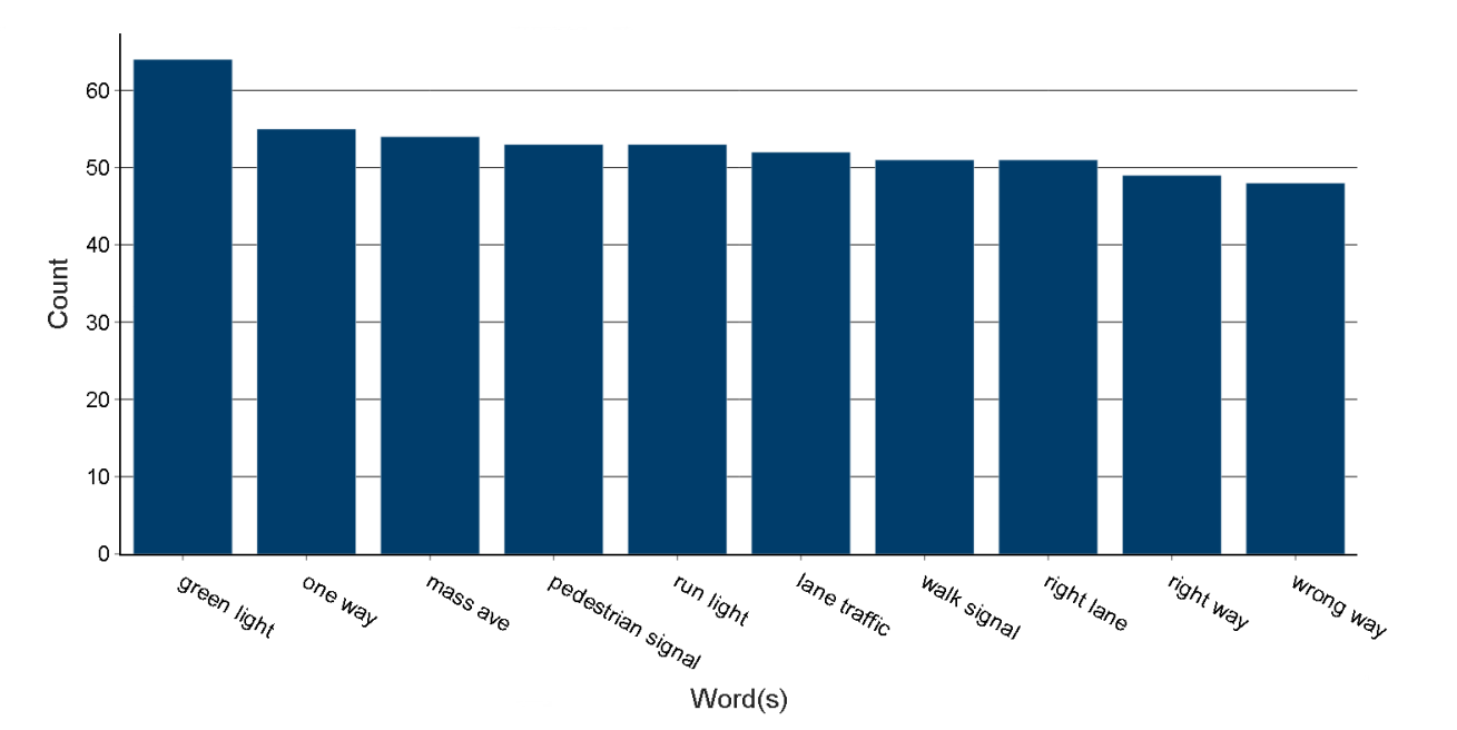
Note that some phrases in this chart appear to contain three words, such as “cyclist stop_light”. These are considered as bigrams, so are included in this ranking, as the words “stop_light” (separated by the underscore and created as part of the vectorisation process) are counted a single token.
The following graphs are generated in this section of the report:
- Count of the top 10 most frequent unigrams (single words)
- Count of the top 10 most frequent bigrams (groups of 2 words)
- Count of the top 10 most important unigrams (based on TF-IDF weighting)
- Count of the top 10 most important bigrams (based on TF-IDF weighting)
Topic Modelling
The final part of the analysis involves training a Latent Dirichlet Allocation (LDA) probabilistic topic model to infer possible themes in the data, given a pre-determined number of topics. The goal of the LDA model is to estimate:
- What words makes up each topic.
- What topics make up each document
Each topic is represented by a probability distribution of words derived from all the documents (referred to as the corpus) in the data. Each word in a topic has probability, which is the likelihood of that word belonging to that topic.
Each document is represented by a mixture of topics. A probability is assigned to each topic that makes up a document which indicates the proportion of the document that is part of that particular topic. A higher value indicates it’s the document’s ‘dominant topic’, as the words in that document are most strongly associated with that topic.
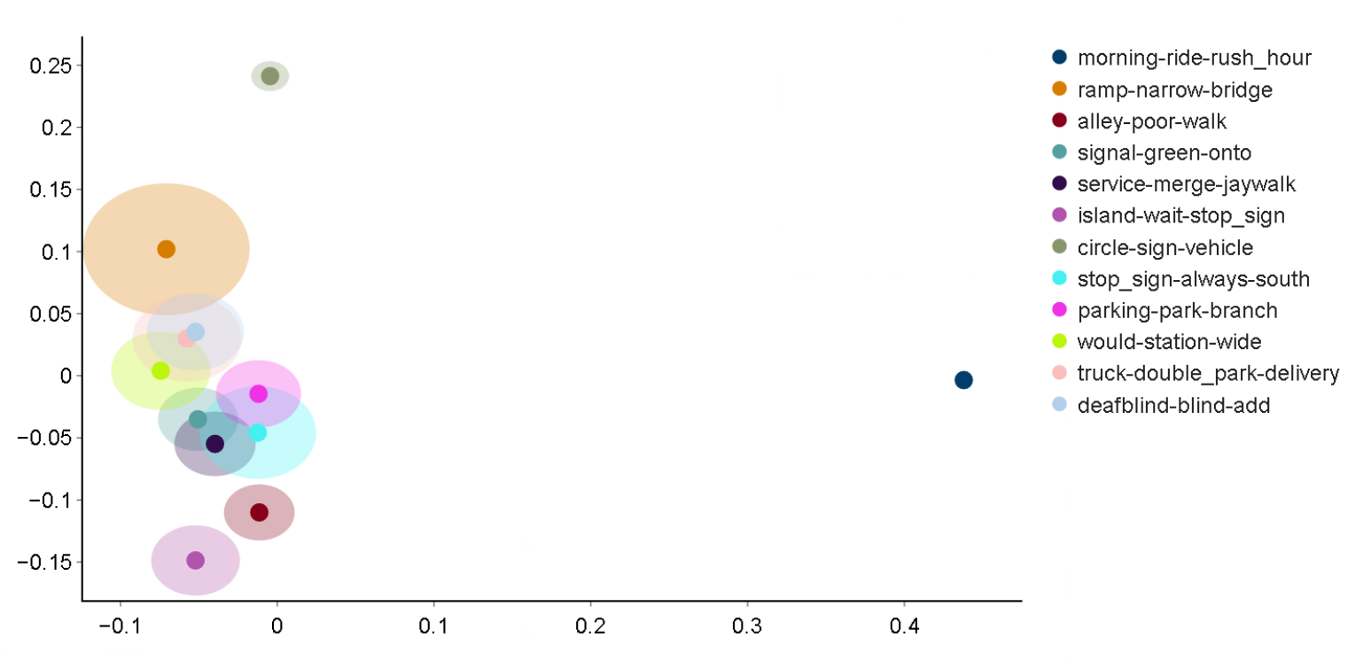
In the Vision Zero Safety data, a topic model with 12 topics was trained, and the top 10 most important words for each topic used to represent the underlying theme that topic represents, as shown in Table 3.
Table 3: Vision Zero Safety data topics represents by top 10 most important words in each topic
| Original Text |
|---|
| ‘ramp’, ‘narrow’, ‘bridge’, ‘use’, ‘wheelchair’, ‘people’, ‘mph’, ‘speeding’, ‘curb’, ‘tree’ |
| ‘signal’, ‘green’, ‘onto’, ‘red’, ‘right’, ‘arrow’, ‘north’, ‘second’, ‘walk’, ‘run_red_light’ |
| ‘circle’, ‘sign’, ‘vehicle’, ‘green’, ‘one’, ‘onto’, ‘frequently’, ‘around’, ‘right’, ‘red_light’ |
| ‘parking’, ‘park’, ‘branch’, ‘police’, ‘creek’, ‘rock’, ‘piney’, ‘enforcement’, ‘car_park’, ‘enforce’ |
| ‘morning’, ‘ride’, ‘rush_hour’, ‘biker’, ‘capitol’, ‘use’, ‘pass’, ‘motorist’, ‘evening’, ‘drive’ |
| ‘truck’, ‘double_park’, ‘delivery’, ‘park’, ‘please’, ‘parking’, ‘alley’, ‘install’, ‘taxi’, ‘school’ |
| ‘stop_sign’, ‘always’, ‘south’, ‘rush_hour’, ‘connecticut’, ‘head’, ‘sign’, ‘go’, ‘routinely’, ‘block_crosswalk’ |
| ‘island’, ‘wait’, ‘stop_sign’, ‘long’, ‘would’, ‘hit’, ‘accident’, ‘one’, ‘many’, ‘lot’ |
| ‘alley’, ‘poor’, ‘walk’, ‘close’, ‘parking’, ‘visibility’, ‘line’, ‘due’, ‘pothole’, ‘car_park’ |
| ‘service’, ‘merge’, ‘jaywalk’, ‘thru’, ‘main’, ‘game’, ‘ignore’, ‘may’, ‘across_street’, ‘riggs’ |
| ‘would’, ‘station’, ‘wide’, ‘people’, ‘always’, ‘use’, ‘cut’, ‘metro’, ‘remove’, ‘protect’ |
| ‘deafblind’, ‘blind’, ‘add’, ‘indicate’, ‘plus’, ‘vibrate’, ‘bump’, ‘thank’, ‘end’, ‘button’ |
An intertopic distance graph is plotted to see how similar the topics are in relation to each other. This can be used to identify whether there are any overlapping themes in the responses, based on the word distributions in each topic. As Figure 4 shows, many topics, particularly relating to cycling, are closely related to each other. This may be because the type of language used across all responses is similar regardless of whether the response is from the perspective of a driver, cyclist or pedestrian.
Figure 4: Topics identified in LDA model
Reports
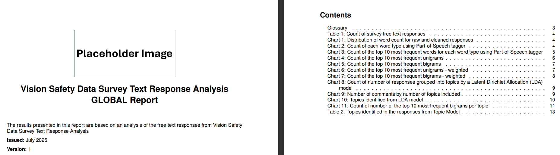
These graphs, accompanied by a brief explanation describing what the plot shows, are automatically saved in report style format, as a PDF file at the end of the analysis. A cover page, contents page and glossary are also included in the final report, as shown in Figure 5. The final report, containing the key points of the analysis in a concise and understandable format, can then be easily distributed to relevant stakeholders in a single file.
Figure 5: The cover and contents page of the final report (Pages 1 and 2)
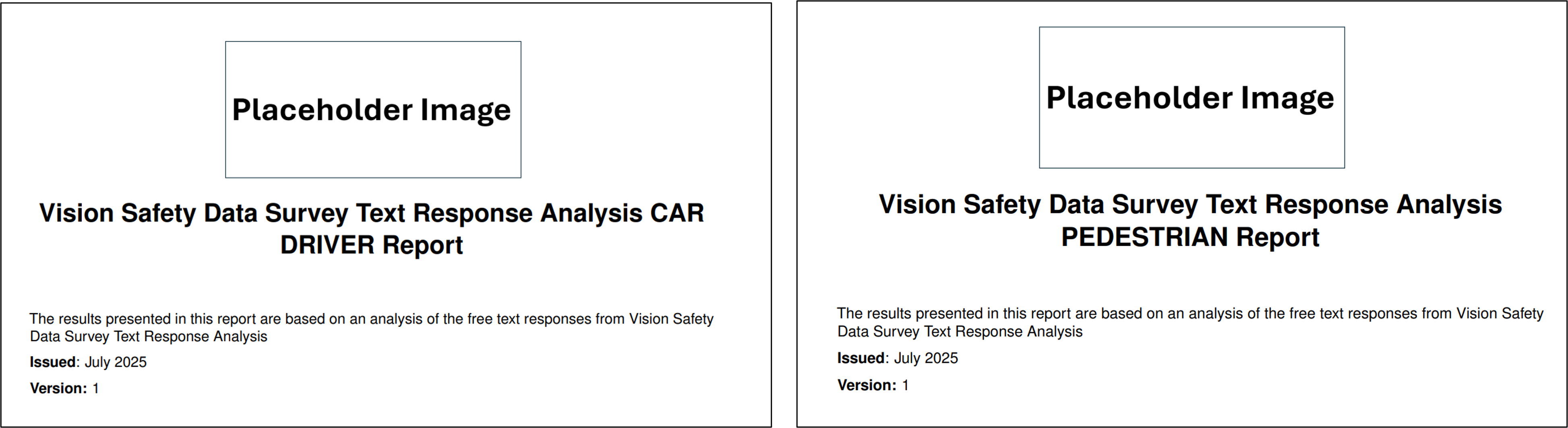
Subgroup Reports
Surveys might collect characteristic data which could be used to filter responses into specific subgroups. For example, each response in the Vision Zero Safety data is labelled based on the type of road user the respondent identifies as when completing the survey (either a cyclist, car driver or pedestrian).
We can run bespoke analysis on each sub population to generate a unique report for each type of respondent. This can help identify group-specific trends that may be hidden in the overall report.
Figure 6: Extracted cover page of three individual reports for each type of user in the Vision Zero Safety dataset
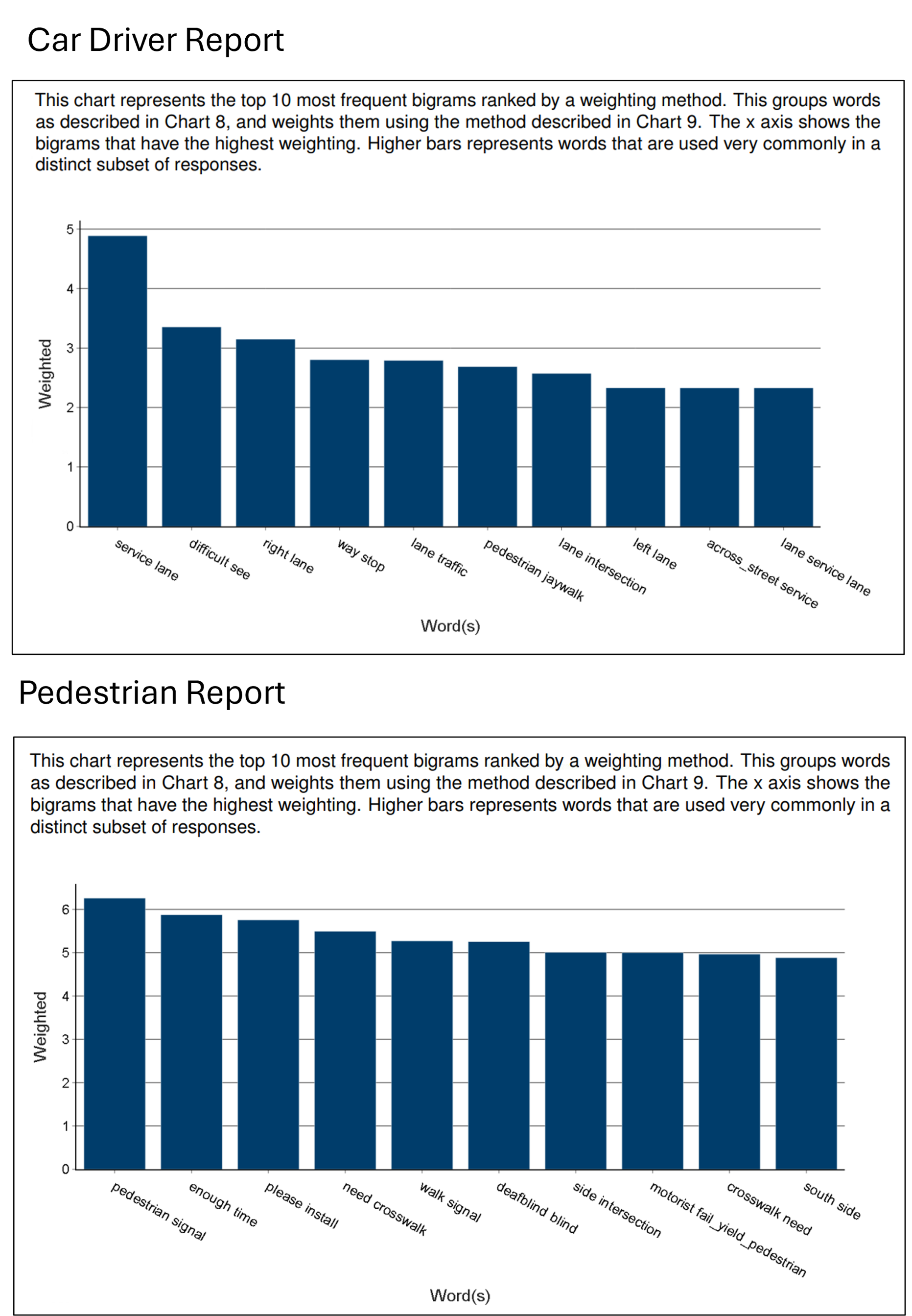
When comparing the most important bigrams for car drivers and pedestrians in the Vision Zero Safety dataset, there is a clear difference in the key theme for each set of responses. Whereas motorists refer to road features, such as lanes and intersections, pedestrians are more likely to reference street crossings and signals.
Figure 7: Extracts from Car drivers and Pedestrian group report comparing the most important bigrams in responses from each group
Practical Example
To implement the code on your own survey responses, please navigate to the supporting GitHub repository and follow the setup instructions in the Readme. Following this, the main steps to generate the reports are:
1) Copy the data into your local directory
Add your data as a .csv file to a new local folder in the ./data/ directory. The new folder must be named after the year of the survey, for example, ./data/2015. Ensure your data has the following columns:
- A text column
- A column containing the group each response is part of (if running reports at a subpopulation level)
2) Update the ./config/inputs/columns.json file
Add the actual names of the group and text columns to the keys in this configuration file, following the format (and changing the year to the actual year you are running the analysis for):
1
2
3
4
5
6
7
{
    "year":{
        "actual_group_column_name":"group",
        "actual_text_column_name":"text"
    }
}
3) Update the ./config/inputs/data.json file
1
2
3
4
5
6
7
8
9
10
11
12
13
14
{
    "survey_name":"Vision Zero Safety",
    "year":2015,
    "report_type":"group",
    "manual_lookup_search":false",
    "run_analysis":true,
    "create_report":true,
    "suppression":3,
    "load_pretrained_model":false,
    "tune_model":true,
    "input_data":"Vision_Zero_Safety.csv"
}
4) Run python analysis.py
The outputs, including the final reports, will be saved to newly created folders in the ./output/ directory for each individual year and report type (group or global).